maria on flicker

maria on flicker

Stylish Tea

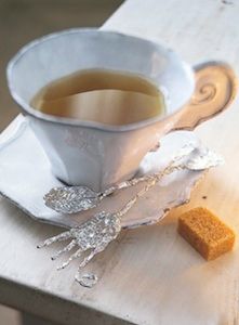
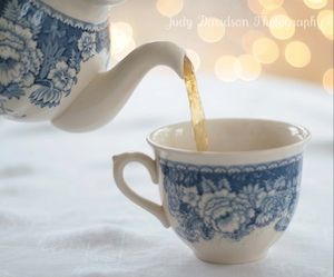
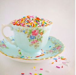
My last post was about styling tea and what is in tea, how could I resist tea cups.

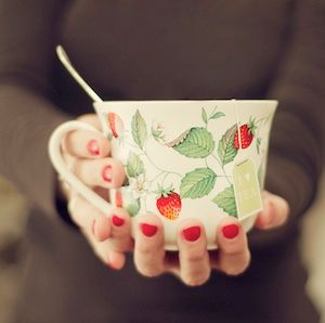
What is so effective about this photo is how it shows a charming pattern then gives it a modern twist. Not something that happens often in the world of traditional tea cups. The dress with its cut and color are up to date (making a great background as well). Even the way the cup is held with no saucer, is modern. I love the shape of the her nails with the current polish color, that emphasizes the red strawberries in the cup. The color red is a great sales tool as well, it attracts attention and increases the warmth of an object (very handy with tea). Believe it or not, the spoon is essential, the focus is on the product throughout the entire composition and it keeps the upper section of the photo from being too blah or empty. Lastly the placement of the tea tag is perfect. It doesn’t cover too much pattern and sits at a jaunty angle. All very, very well done

1_liz take me home country road

1_liz take me home country road

2_judy davidson photography

2_judy davidson photography

3_ticker tape parade

3_ticker tape parade

4_lolly won_flicker

4_lolly won_flicker

1_My favorite cup appears handmade. It can stand on its own, or as shown here, be combined with an unusual props. The wacky fork and spoon, the perfect rectangular tan sugar cube, pale tabletop finish all give extra interest to the cup. The corner of the table gives it a sense of place. Clearly someplace where I want to be.

2_The blue transfer ware tea-cup and pot are pleasant, yet made special, even magical with the sparkle in the background. I do love sparkle. When you style a product, finding something colorful that plays with the color of the product is always a winner.

3_Sprinkles add the color and a touch of whimsy, making this cup appealing, and the word sprinkles has a touch of humor and lightness that adds to the whimsy.

4_I was attracted to this photo because it could visually go different directions. If it’s about the cups, I love that they are stacked and tilted, but would need to see the handles. If it’s about the tea, it is close yet there are a few items to re-style. I love the shimmer of the silk bag, how clearly you can see the tea and the string with the tag filling the space (also called negative space). However, the tag would need to be turned right side up, so its readable, straighten the string, giving it a straight line, directing the eye where to go.The background of green and wood or bamboo finishes the composition tying it altogether.